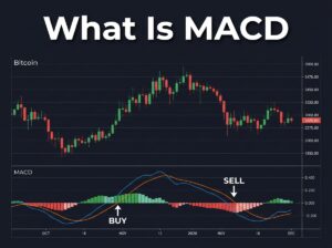
MACD(이동평균 수렴·확산 지표)는 두 개의 이동평균선 간의 관계를 보여주는 모멘텀 지표입니다. MACD선(12일 EMA – 26일 EMA), 시그널선(MACD의 9일 EMA), 히스토그램(둘의 차이)으로 구성됩니다. MACD선이 시그널선 위로 교차하면 강세 신호, 아래로 교차하면 약세 신호입니다. RSI·캔들스틱·이동평균선과 함께 사용하면 정확도가 크게 높아지며, 초보자는 4시간·1일 차트에서 사용하는 것이 가장 효과적입니다.
You have already learned how to read moving averages and RSI. MACD is the third essential indicator that brings them together into a more complete picture. While moving averages show you the trend direction and RSI shows you whether an asset is overbought or oversold, MACD shows you the momentum behind the trend — whether it is getting stronger or fading.
이동평균선과 RSI 읽는 법은 이미 배웠습니다. MACD는 이것들을 더 완전한 그림으로 결합하는 세 번째 필수 지표입니다. 이동평균선이 추세 방향을, RSI가 과매수·과매도를 보여준다면, MACD는 추세 뒤의 모멘텀 — 강해지고 있는지 약해지고 있는지를 보여줍니다.
What MACD Stands For and How It Is Calculated
MACD stands for Moving Average Convergence Divergence. The name sounds complex but the concept is straightforward. It measures the relationship between two exponential moving averages of different lengths and shows you whether they are moving toward each other (converging) or away from each other (diverging).
MACD는 이동평균 수렴·확산(Moving Average Convergence Divergence)의 약자입니다. 이름은 복잡하게 들리지만 개념은 간단합니다. 서로 다른 기간의 두 지수이동평균 간의 관계를 측정하여 서로 가까워지고 있는지(수렴) 멀어지고 있는지(확산)를 보여줍니다.
The indicator has three components that work together.
이 지표는 함께 작동하는 세 가지 구성 요소가 있습니다.
The MACD line is calculated by subtracting the 26-day EMA from the 12-day EMA. When the short-term trend is rising faster than the long-term trend, the MACD line moves above zero. When the short-term trend is falling faster, the MACD line drops below zero. This line is the core of the indicator and represents the raw momentum.
MACD선은 12일 EMA에서 26일 EMA를 빼서 계산합니다. 단기 추세가 장기 추세보다 빠르게 상승하면 MACD선이 0 위로 올라갑니다. 단기 추세가 더 빠르게 하락하면 MACD선이 0 아래로 내려갑니다. 이 선이 지표의 핵심이며 원시 모멘텀을 나타냅니다.
The signal line is a 9-day EMA of the MACD line itself. Think of it as a smoothed version of the MACD line that reacts more slowly. The signal line acts as a trigger — when the MACD line crosses above or below the signal line, it generates trading signals.
시그널선은 MACD선 자체의 9일 EMA입니다. MACD선의 더 느리게 반응하는 평활 버전이라고 생각하세요. 시그널선은 트리거 역할을 합니다 — MACD선이 시그널선 위나 아래로 교차할 때 거래 신호를 생성합니다.
The histogram is a visual bar chart that shows the difference between the MACD line and the signal line. When the bars are above zero and growing taller, bullish momentum is increasing. When the bars are above zero but shrinking, the bullish momentum is fading even though the trend is still technically positive. This early warning is one of the most valuable features of the histogram.
히스토그램은 MACD선과 시그널선의 차이를 보여주는 시각적 막대 차트입니다. 막대가 0 위에 있고 점점 높아지면 강세 모멘텀이 증가하고 있습니다. 막대가 0 위에 있지만 줄어들면 추세가 기술적으로는 여전히 긍정적이지만 강세 모멘텀이 약해지고 있는 것입니다. 이 조기 경보가 히스토그램의 가장 가치 있는 기능 중 하나입니다.
The Two Key Signals Every Beginner Should Watch
You do not need to master every MACD technique to start using it effectively. Two signals cover 90% of what beginners need.
MACD를 효과적으로 사용하기 위해 모든 기술을 마스터할 필요는 없습니다. 두 가지 신호가 초보자에게 필요한 것의 90%를 커버합니다.
Signal 1 — MACD Line Crosses Above the Signal Line (Bullish)
When the MACD line crosses above the signal line, it means short-term momentum is accelerating faster than the smoothed average. This is a bullish signal suggesting that buying pressure is increasing and the price may continue to rise.
MACD선이 시그널선 위로 교차하면 단기 모멘텀이 평활 평균보다 빠르게 가속하고 있다는 뜻입니다. 이것은 매수 압력이 증가하고 있으며 가격이 계속 상승할 수 있음을 시사하는 강세 신호입니다.
For example, if Bitcoin has been falling for two weeks and the MACD line suddenly crosses above the signal line while the histogram bars turn from red to green, this suggests the selling pressure is exhausted and buyers are stepping in. This is especially powerful when it happens near a known support level and when RSI is also rising from the oversold zone below 30.
예를 들어, 비트코인이 2주간 하락하다가 MACD선이 갑자기 시그널선 위로 교차하면서 히스토그램 막대가 빨간색에서 초록색으로 바뀌면, 매도 압력이 소진되고 매수자가 진입하고 있음을 시사합니다. 이것은 알려진 지지선 부근에서 RSI도 30 이하 과매도 영역에서 상승할 때 특히 강력합니다.
Signal 2 — MACD Line Crosses Below the Signal Line (Bearish)
The opposite crossover — MACD line dropping below the signal line — is a bearish signal. It means the upward momentum is fading and selling pressure is taking over. The histogram bars will shrink and then flip to negative territory.
반대 교차 — MACD선이 시그널선 아래로 내려가는 것 — 은 약세 신호입니다. 상승 모멘텀이 약해지고 매도 압력이 장악하고 있다는 뜻입니다. 히스토그램 막대가 줄어들다가 음의 영역으로 전환됩니다.
If you are holding a Bitcoin position and the MACD line crosses below the signal line on the daily chart, this is a warning to consider tightening your stop-loss or taking partial profits. It does not mean you must sell immediately, but it tells you that the momentum supporting your position is weakening.
비트코인 포지션을 보유하고 있는데 일봉 차트에서 MACD선이 시그널선 아래로 교차하면, 손절을 타이트하게 하거나 부분 수익 실현을 고려하라는 경고입니다. 즉시 매도해야 한다는 뜻은 아니지만, 포지션을 지지하는 모멘텀이 약해지고 있다고 알려줍니다.
MACD Divergence — The Advanced Signal Worth Learning Early
Divergence is when the price and the MACD indicator move in opposite directions. This is one of the most powerful signals in technical analysis because it often predicts trend reversals before they happen.
다이버전스는 가격과 MACD 지표가 반대 방향으로 움직이는 것입니다. 이것은 추세 반전이 일어나기 전에 종종 예측하기 때문에 기술적 분석에서 가장 강력한 신호 중 하나입니다.
Bullish divergence occurs when the price makes a lower low but the MACD makes a higher low. This means that even though the price dropped to a new low, the selling momentum behind that drop was weaker than before. The sellers are losing steam, and a reversal upward may be approaching. During the Iran war dip, Bitcoin’s price fell from $69,000 to $63,000, but some analysts noted that MACD was forming higher lows — a classic bullish divergence that preceded the recovery to $66,500.
강세 다이버전스는 가격이 더 낮은 저점을 만들지만 MACD는 더 높은 저점을 만들 때 발생합니다. 이것은 가격이 새로운 저점으로 떨어졌지만 그 하락 뒤의 매도 모멘텀이 이전보다 약했다는 뜻입니다. 이란 전쟁 하락 때 비트코인 가격은 $69,000에서 $63,000으로 떨어졌지만, 일부 애널리스트는 MACD가 더 높은 저점을 형성하고 있다고 지적했습니다 — $66,500으로의 회복을 선행한 전형적인 강세 다이버전스입니다.
Bearish divergence is the reverse — the price makes a higher high but the MACD makes a lower high. The price is climbing but the momentum driving that climb is weakening. This is often seen near market tops and is a signal to be cautious rather than greedy.
약세 다이버전스는 반대입니다 — 가격이 더 높은 고점을 만들지만 MACD는 더 낮은 고점을 만듭니다. 가격은 오르고 있지만 상승을 주도하는 모멘텀이 약해지고 있습니다. 이것은 시장 고점 부근에서 자주 보이며 욕심보다 신중해야 한다는 신호입니다.
How to Add MACD on TradingView
Open TradingView and click the “Indicators” button at the top of your chart. Search for “MACD” and select the one labeled “MACD” by TradingView. It will appear as a separate panel below your price chart, showing the MACD line, signal line, and histogram bars.
TradingView를 열고 차트 상단의 “Indicators” 버튼을 클릭하세요. “MACD”를 검색하고 TradingView의 “MACD”를 선택하세요. 가격 차트 아래에 별도 패널로 나타나며 MACD선, 시그널선, 히스토그램 막대를 보여줍니다.
Keep the default settings of 12, 26, and 9. These are the standard parameters used by the vast majority of traders, which means the signals you see are the same ones that thousands of other market participants are watching. Changing these numbers as a beginner adds complexity without adding value.
기본 설정 12, 26, 9를 유지하세요. 이것은 대다수 트레이더가 사용하는 표준 매개변수이며, 여러분이 보는 신호가 수천 명의 다른 시장 참가자들이 주시하는 것과 동일합니다. 초보자가 이 숫자를 변경하면 가치 없이 복잡성만 추가됩니다.
The Biggest MACD Mistake Beginners Make
The most common mistake is using MACD on very short time frames like the 5-minute or 15-minute chart. On these tiny time frames, MACD produces an overwhelming number of signals, and many of them are false. The indicator was designed for longer time frames where trends develop more clearly.
가장 흔한 실수는 5분이나 15분 차트 같은 매우 짧은 시간 프레임에서 MACD를 사용하는 것입니다. 이런 작은 시간 프레임에서 MACD는 압도적으로 많은 신호를 생성하며, 많은 것이 거짓 신호입니다. 이 지표는 추세가 더 명확하게 발전하는 긴 시간 프레임을 위해 설계되었습니다.
As a beginner, use MACD on the 4-hour chart or the daily chart. These time frames filter out the short-term noise and give you more reliable signals. A bullish crossover on the daily chart is far more significant than one on the 15-minute chart.
초보자로서 MACD를 4시간 차트나 일봉 차트에서 사용하세요. 이 시간 프레임은 단기 노이즈를 걸러내고 더 신뢰할 수 있는 신호를 제공합니다. 일봉 차트의 강세 교차가 15분 차트의 교차보다 훨씬 더 의미 있습니다.
Combining MACD With Your Other Tools
MACD should never be used alone. The strongest trade setups happen when multiple indicators agree at the same time. Here is what a high-confidence bullish setup looks like using the tools you have learned so far.
MACD는 절대 단독으로 사용해서는 안 됩니다. 가장 강력한 거래 셋업은 여러 지표가 동시에 일치할 때 발생합니다. 지금까지 배운 도구들로 높은 확신의 강세 셋업이 어떤 모습인지 보여드리겠습니다.
The price bounces off a known support level. A bullish candlestick pattern like a Hammer or Morning Star forms at that support. RSI is below 30 or rising from the oversold zone. The MACD line crosses above the signal line and the histogram turns green. The price is approaching or crossing above the 50-day moving average.
가격이 알려진 지지선에서 반등합니다. 해머나 모닝스타 같은 강세 캔들스틱 패턴이 그 지지선에서 형성됩니다. RSI가 30 이하이거나 과매도 영역에서 상승합니다. MACD선이 시그널선 위로 교차하고 히스토그램이 초록색으로 바뀝니다. 가격이 50일 이동평균선에 접근하거나 위로 교차합니다.
When three or more of these conditions line up simultaneously, you have a high-probability trade setup. No single indicator is perfect, but the combination dramatically increases your odds of being on the right side of the market.
이 조건 중 세 가지 이상이 동시에 정렬되면 높은 확률의 거래 셋업을 갖게 됩니다. 단일 지표는 완벽하지 않지만, 조합은 시장의 올바른 편에 있을 확률을 극적으로 높여줍니다.
If you want to practice combining MACD with RSI and moving averages on real-time charts, Tapbit provides all the charting tools you need in one clean interface.
실시간 차트에서 MACD를 RSI와 이동평균선과 결합하는 연습을 하고 싶다면, Tapbit이 하나의 깔끔한 인터페이스에서 필요한 모든 차트 도구를 제공합니다.
Ready to start your crypto journey? Sign up for Tapbit and begin trading today.
Disclosure: This article contains affiliate links. We may earn a small commission at no extra cost to you.